5 Quick Tips to Improve Lead Gen Landing Pages

Tim Ash
What does your website look like to your customers?
You put a lot of time and effort into designing your pages, so you probably think you have built something truly beautiful. But Tim Ash, author of “Landing Page Optimization” and CEO of SiteTuners, says your website visitors probably aren’t enjoying the experience as much as you think.
To your visitors, it might feel as if you’re asking them to scale castle walls. Without even realizing it, you’ve built these walls brick by brick out of compromise, political expediency, lack of understanding your audience, technical limitations and insufficient resources.
Ash offered five quick tips to help you tear down those walls and dramatically improve your lead generation landing pages during his session at the 2013 Inside Sales Virtual Summit. You can see his full presentation in the video below.
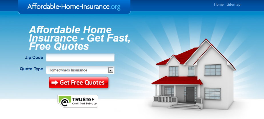
Tip #1: Clear call-to-action
What do you want your website visitors to do on your page? Do you want them to download your ebook, request a demo or buy a boatload of Burma-Shave? The best way to get them to do that is to include a clear call-to-action.
Here’s a well-executed direct response page. It’s pretty clear that if you want an affordable home insurance fast quote, you put in your ZIP code and the quote type and click the red button.
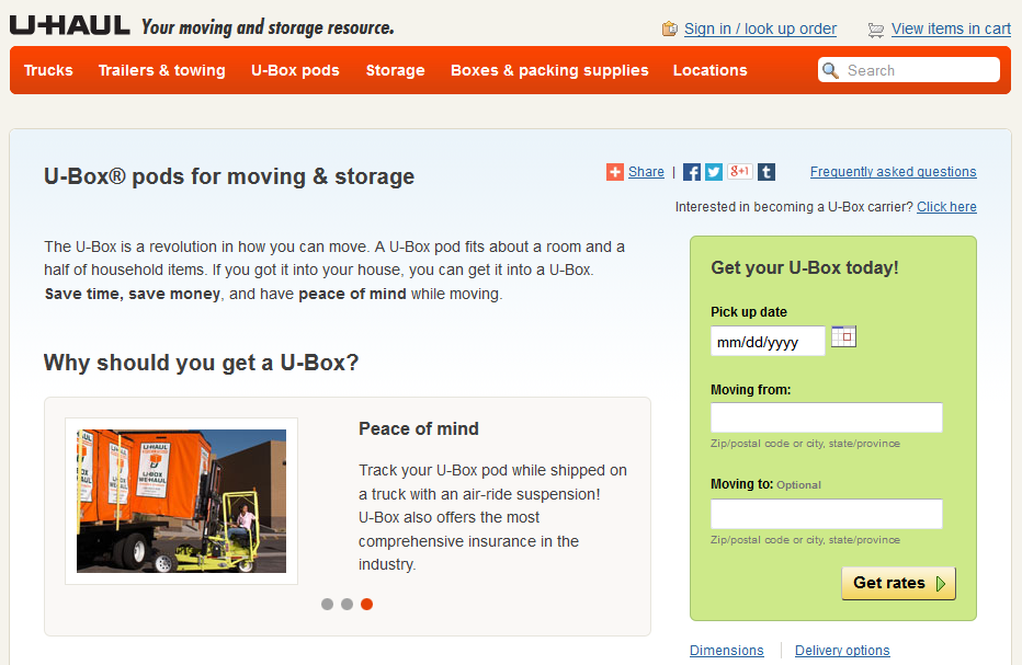
Tip #2: Stop asking for unnecessary info
If you ask for too much information, people won’t fill out the forms on your website. You might think you have to ask a billion and one questions because that’s the only way you can qualify your leads. But if you overdo it, you’re killing your conversion rates. Your visitors are busy people who don’t have time to fill out forms all day.
U-Haul does a good job of just asking for the minimum information it needs to give you a quote.
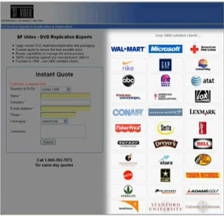
Tip #3: Reduce the amount of text
No one likes to read “War and Peace” on a computer screen. If you overload your lead gen landing pages with big blocks of text, you’ll lose a good chunk of the audience you worked so hard to bring to your website.
Here’s a screenshot of a page that is packed full of text. It’s not likely that many people will take the time to read all of that.

Tip #4: Eliminate visual distractions
Just because a page looks pretty doesn’t mean it is optimized for conversions. Here’s an example of overwhelming imagery that might distract visitors from what you really want them to do. Ash says the graphic designers had a field day with this page to the detriment of conversion.

Tip #5: Increase trust
It’s hard to build trust online. You can’t have a face-to-face relationship, so it all depends on your visitors’ experience on your website. That’s why this lead gen landing page features so many customer logos — it’s a trust-building tactic that’s been proven to work.
Take a look at your website and identify some of these common mistakes on your own landing pages. They should be pretty easy to spot. Find more of Ash’s tips in his book, Landing Page Optimization.
Free eBook: The Ultimate Revenue Engine
Learn how to dramatically increase revenue by combining sales and marketing automation.
